Color Diary · No. 1
Living with Sherwin-Williams Sea Salt: The Ten-Year Verdict
The internet's favorite spa color, reviewed honestly: the rooms where it turns blue on you, the finishes it fights with, and what to paint instead.

Susan HartleyAugust 26, 2026 · 14 min read
Sea Salt · Sherwin-Williams SW 6204
Hex#CDD2CALRV63Undertonesgreen → gray → blue
In our last house, a 1990s colonial with builder-grade oak and bathrooms that got very little natural help from the sun, I did what roughly four million other homeowners did between 2010 and 2020: I bought two gallons of Sherwin-Williams Sea Salt (SW 6204) and painted the family bath on a Saturday morning.
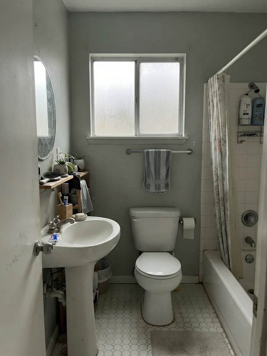
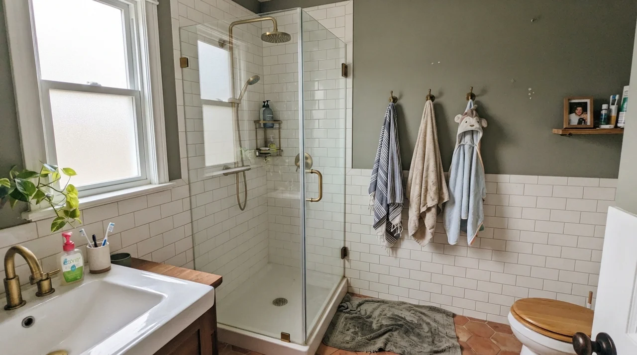
By Sunday afternoon, with the painter's tape pulled and the brushed brass shower fixtures screwed back into the wall, it looked like a boutique hotel catalog. By Tuesday morning, under a flat gray November drizzle through a north-facing frosted window, it looked like a pale surgical scrub room. I stood by the door handle with a cup of coffee and wondered if the paint mixer at the store had accidentally grabbed a blue tint.
He hadn't. That is simply Sea Salt doing what Sea Salt does when the light shifts. Over thirty years and three houses, I have learned that some paints are loyal soldiers—they look like the paper swatch at 8:00 AM, 2:00 PM, and under a 60-watt lamp at midnight. Sea Salt is not one of them. It is an honest chameleon sitting at Light Reflectance Value (LRV) 63, balanced on a knife-edge between soft muted green, slate gray, and watery blue. When it gets the right light, it is breathtaking. When it doesn't, you will be the next person asking why your green bathroom turned baby blue.
The Three Faces of Sea Salt
Because Sea Salt carries green, gray, and blue in nearly equal proportion, it shifts dramatically depending on your window exposure and bulb temperature. Here is how the undertones move in real rooms:
warm sun
overcast, north light
dusk, rain, cool bulbs
South light pulls out the soft sage green. North light and cool LEDs strip the green and leave a watery blue. Dim hallways turn it straight to flat gray.
Gray CashmereBenjamin Moore · see diary
Quiet MomentsBenjamin Moore · see diary
Sea SaltSW 6204
Gray OwlBenjamin Moore · see diary
Filmy GreenSherwin-Williams · see diary
How Light Rewrites the Wall from Morning to Night
The single biggest mistake homeowners make with Sea Salt is choosing it from a two-inch chip under the fluorescent strip lights of a retail counter. In our 1970s split-level, I learned the hard way that bedroom colors need to survive early morning gloom just as well as afternoon sun.
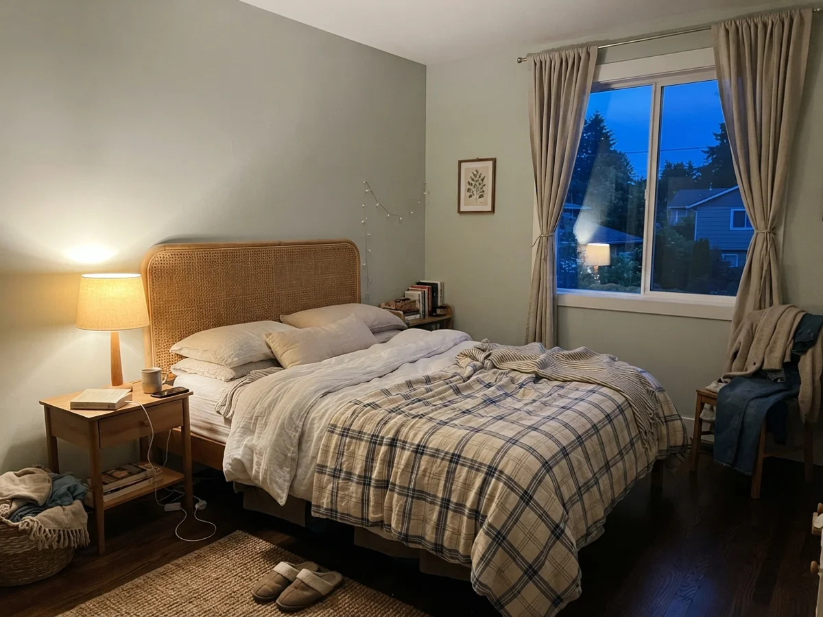
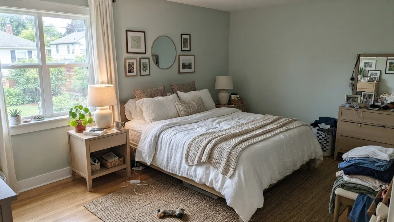
In a bedroom with cool morning daylight, before any lamps are switched on, Sea Salt can read surprisingly pale and washed out. The warmth hasn't woken up yet, and the green retreats into the background. But flick on a single 2700K bedside lamp at dusk, let the blue evening light settle outside the window, and that same wall suddenly warms into a rich, cocooning herbal tone that plays beautifully against woven cane or rattan.
Bathrooms: The Room That Made It Famous
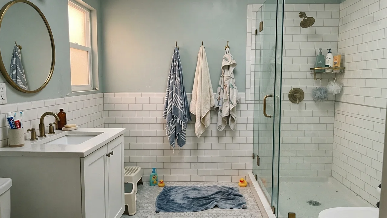
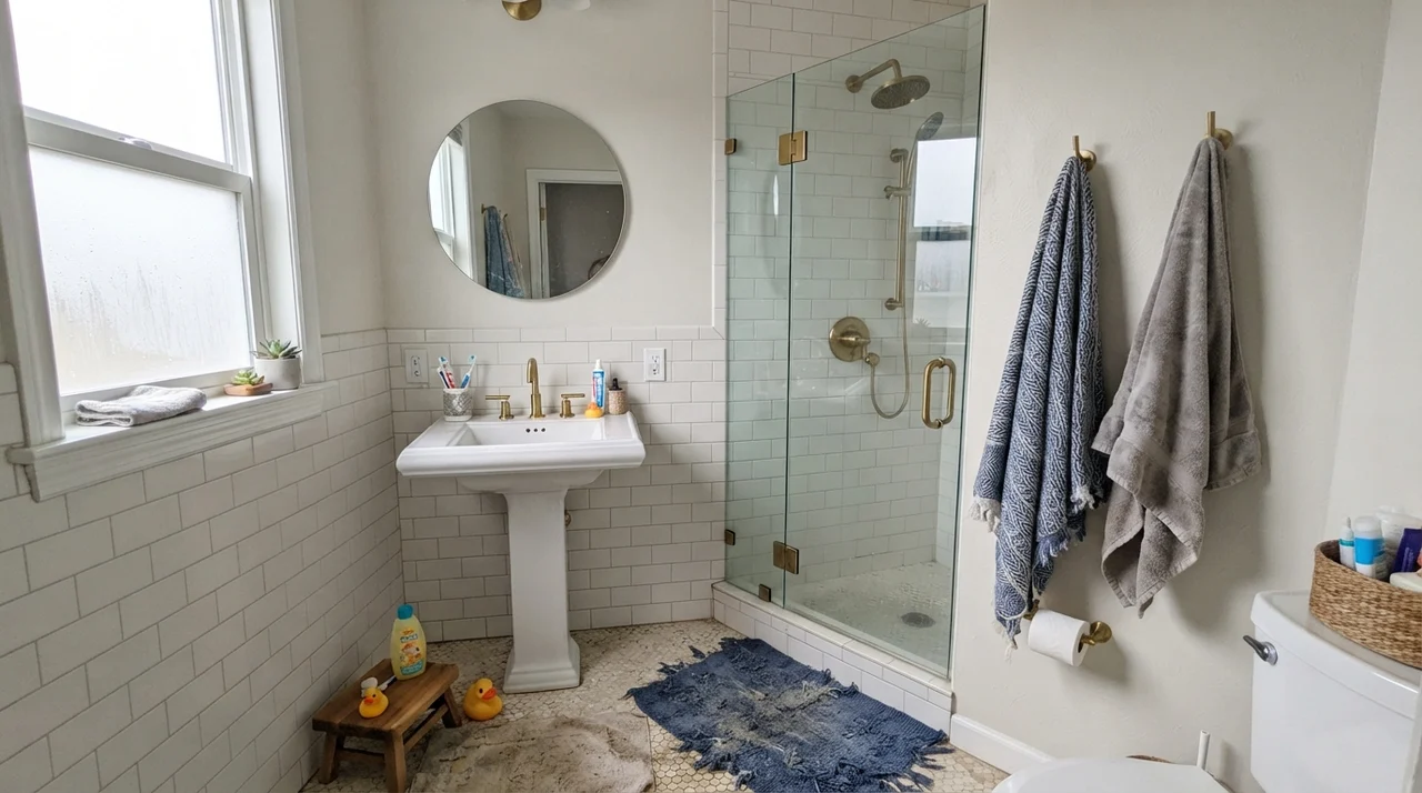
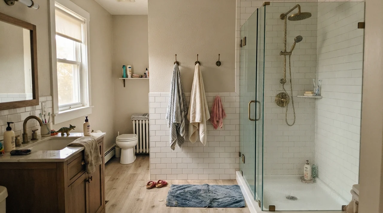
There is a reason Sea Salt became Sherwin-Williams' global rank 7 superstar and the default darling of bathroom renovations. In a bath with crisp white subway tile, clean white grout, and ample light, it delivers that elusive 'spa' feeling without looking like you tried too hard. At LRV 63, it bounces enough light to keep small bathrooms bright and open rather than closing them in, while still giving you distinct pigment against bright white porcelain.
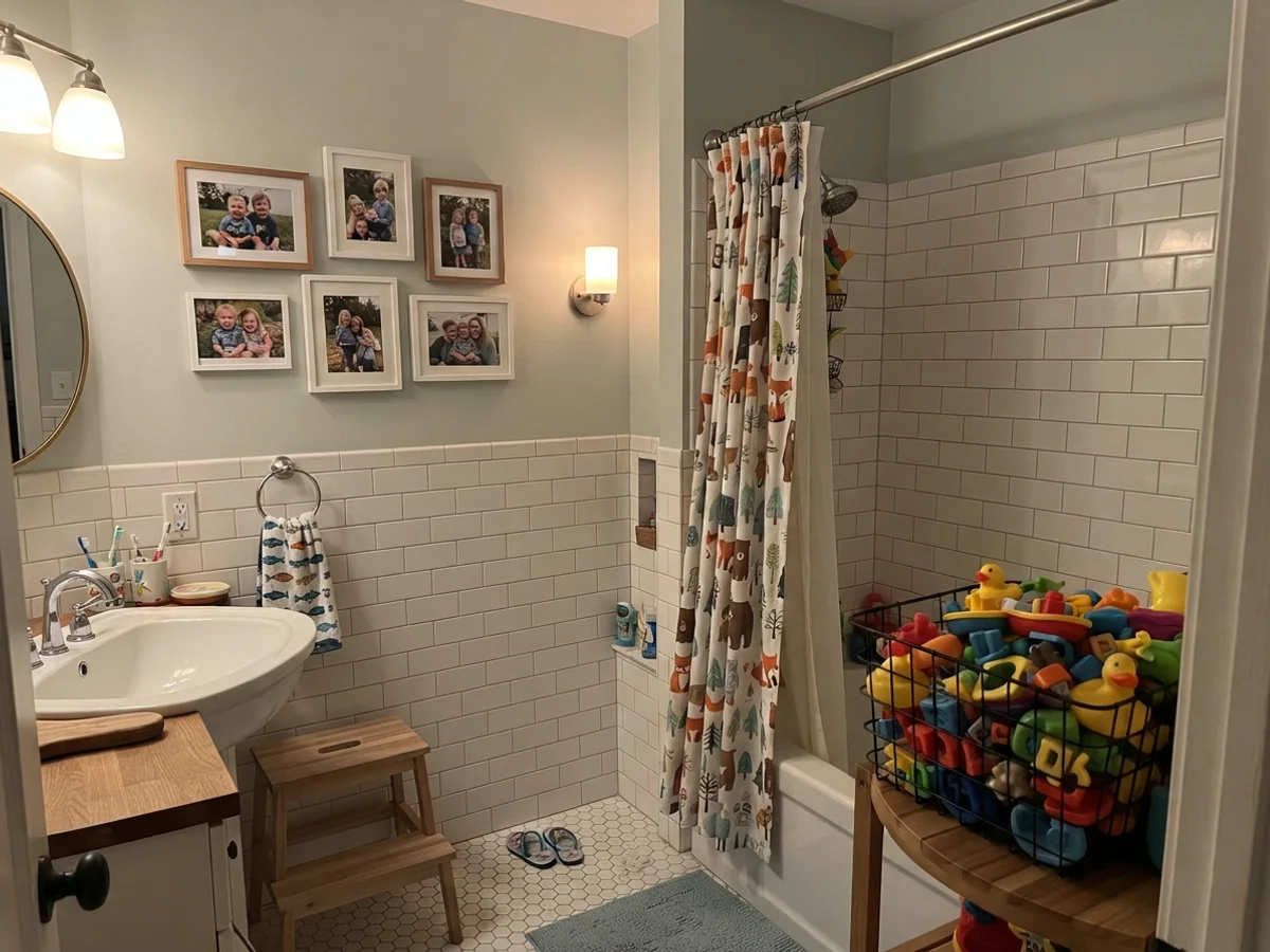
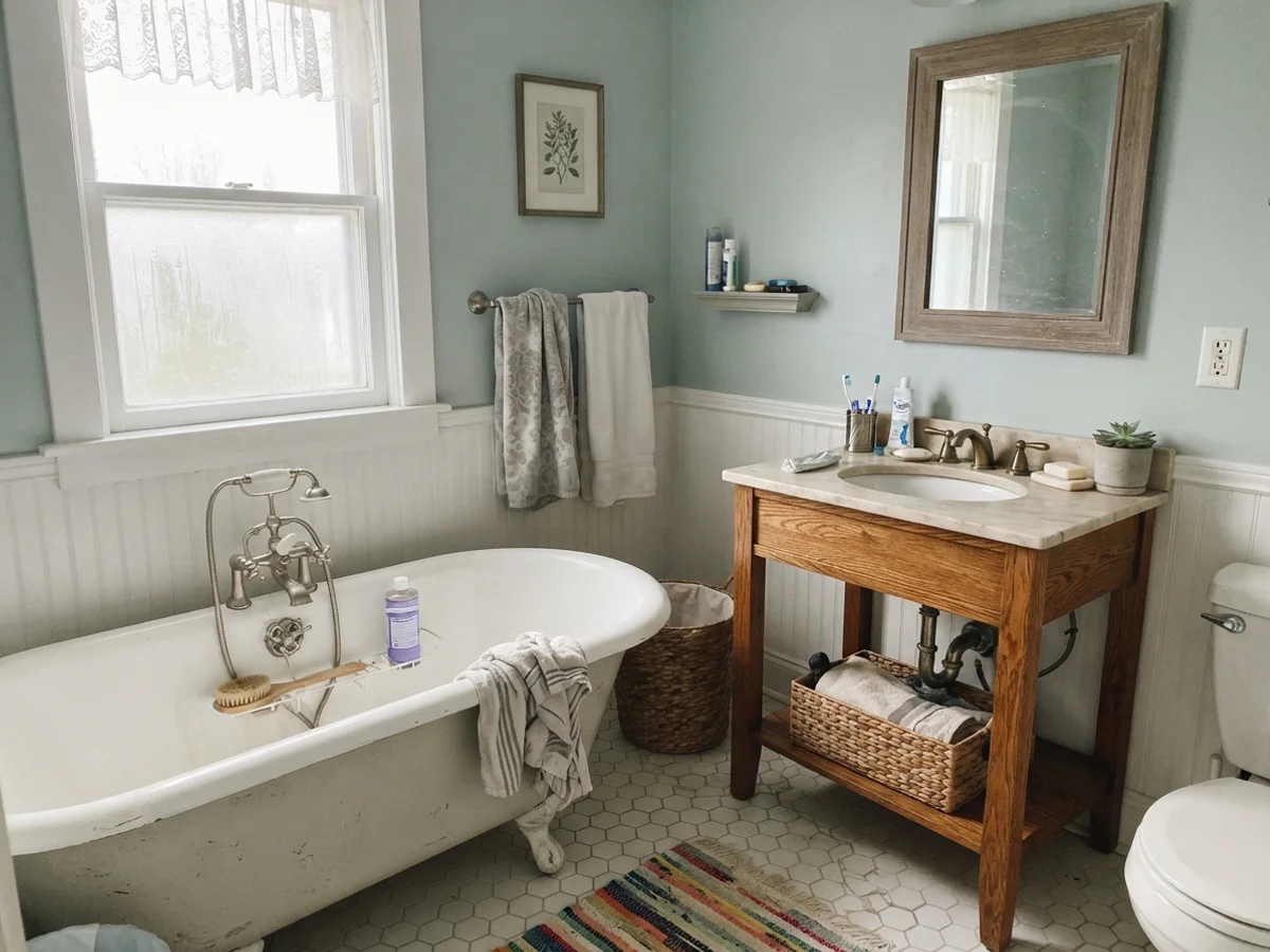
We lived with it in our kids' bathroom for six years. Painted in satin so it could be scrubbed clean after bath-time splashes, it held up remarkably well against moisture and routine washcloth wiping. When paired with white hex tile floors or clawfoot tubs in cottage-style bathrooms, the gentle herbal undertone brings out the character of older architecture without looking dated within two seasons.
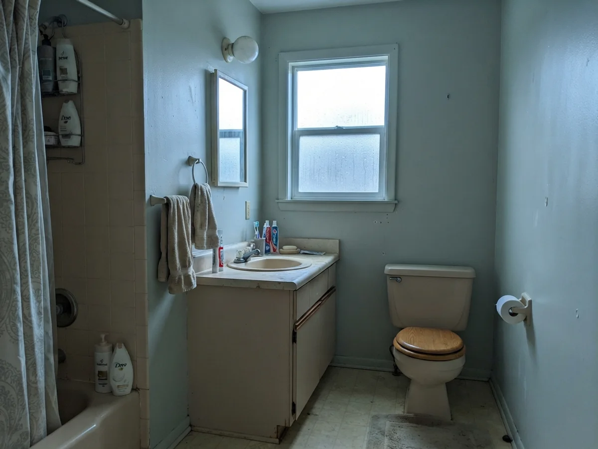
That said, you have to be realistic about your bathroom's orientation. When overcast daylight filters through a frosted window, Sea Salt drops its green coat and leans distinctly into a quiet, muted gray. And if you put it into a dated bathroom facing north on a rainy day—especially alongside an older beige vanity—it picks up a chilly blue cast that can feel stark.
You don't choose a paint for the Saturday you roll it on. You choose it for year four, when the light is flat and you've scrubbed the wall a dozen times.
Bedrooms and Nurseries: Quiet, Forgiving, and Calming
In our current 1960s ranch, I used Sea Salt on the walls of a guest room that gets steady east-facing morning light. Five years in, it remains one of the easiest spaces in the house to live with. Because the color has low saturation, it behaves almost like a neutral. You can throw crisp white linen bedding on the bed, add pale oak nightstands and ceramic lamps, and the room feels pulled-together without demanding attention.
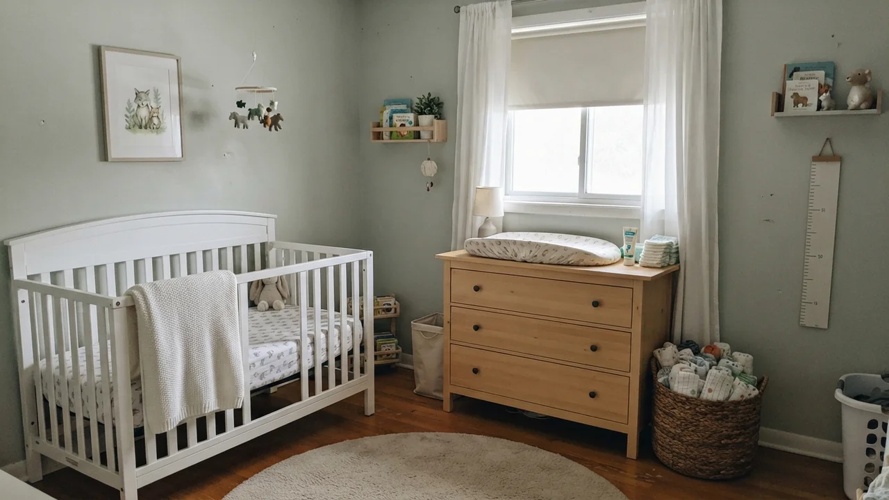
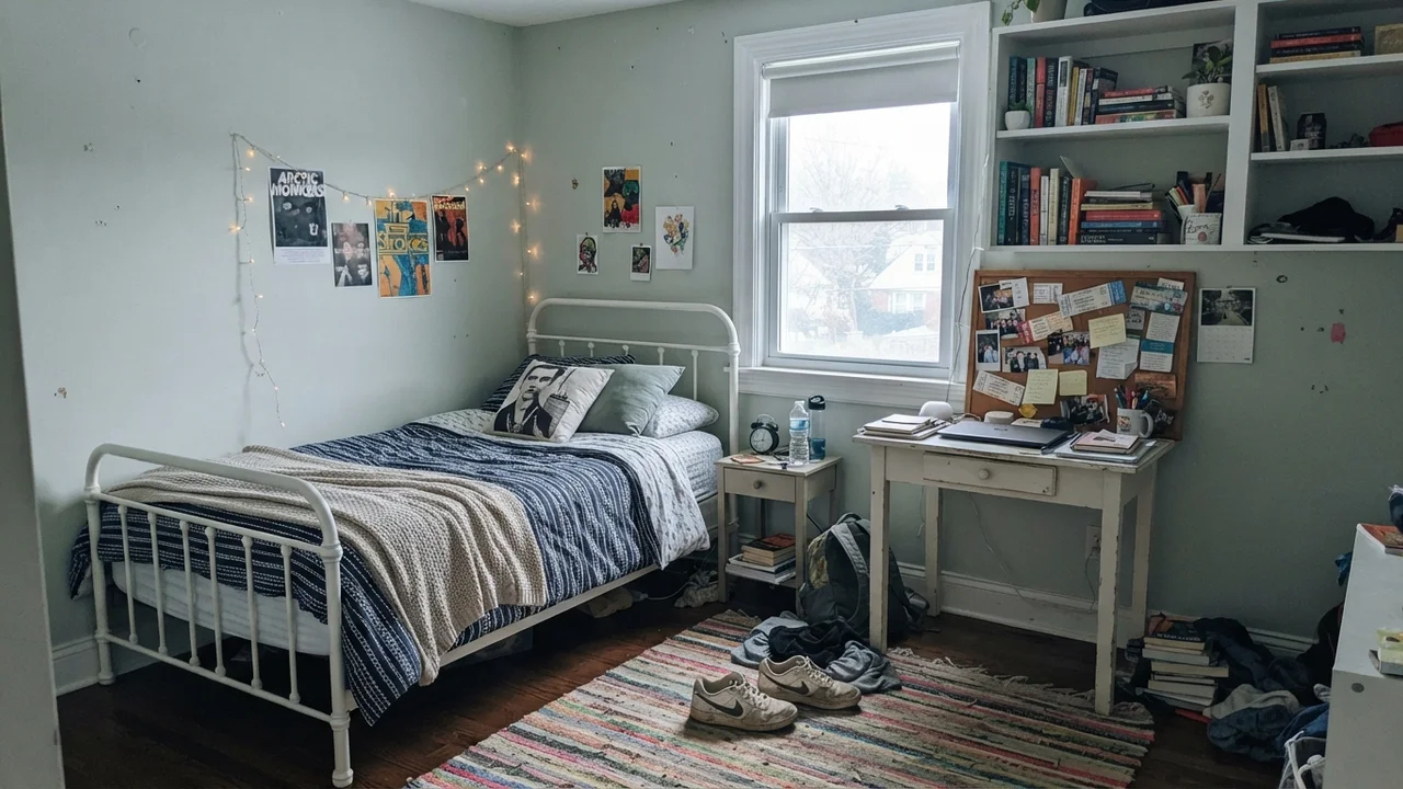
It is equally well-suited for nurseries and teenagers' rooms because it refuses to feel childish. In a nursery with sheer curtains, a white crib, and light-wood furniture, it gives gentle depth without overpowering the room. As kids grow into teenagers, that same wall color transitions seamlessly into desks, open book shelving, and corkboards without requiring a full weekend repaint before high school.
Kitchens, Cabinets, and Built-Ins: The Understated Accent
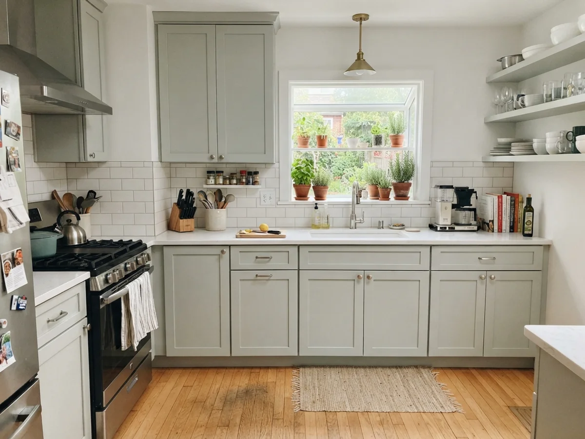
Most people default to painting drywall with Sea Salt, but some of the best applications I've seen over thirty years have been on cabinetry and millwork. If you want color on kitchen cabinets without committing to an aggressive navy or forest green that will look dated within five years, Sea Salt in a satin finish is worth the money.
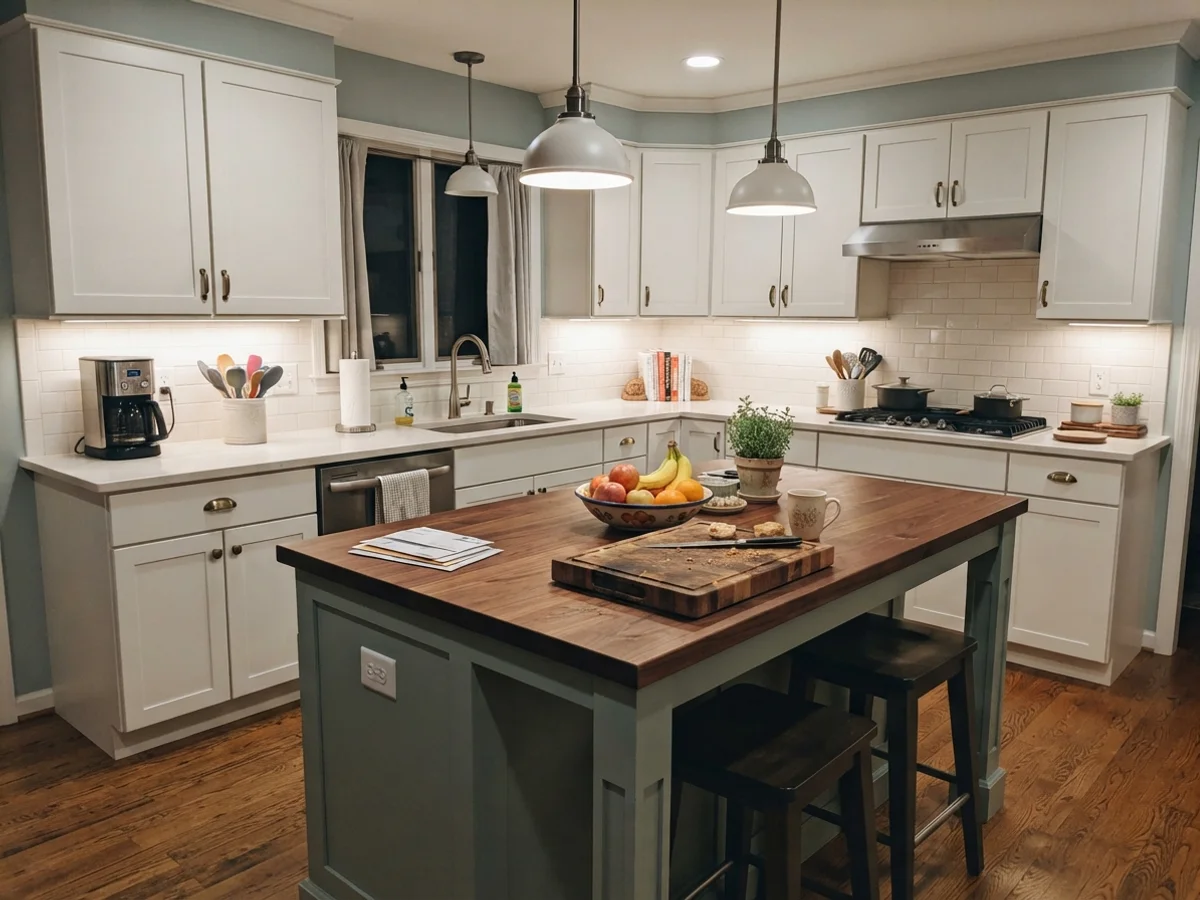
On full upper and lower shaker cabinets paired with a white subway tile backsplash, white quartz counters, and light oak flooring, it provides a tailored coastal presence that feels permanent. Even if you only paint a central kitchen island and keep the surrounding perimeter cabinetry white, it breaks up an all-white kitchen while harmonizing with everyday kitchen life—cutting boards, fruit bowls, and the unavoidable clutter of family cooking.
Living Rooms, Sunrooms, and Trim Accents
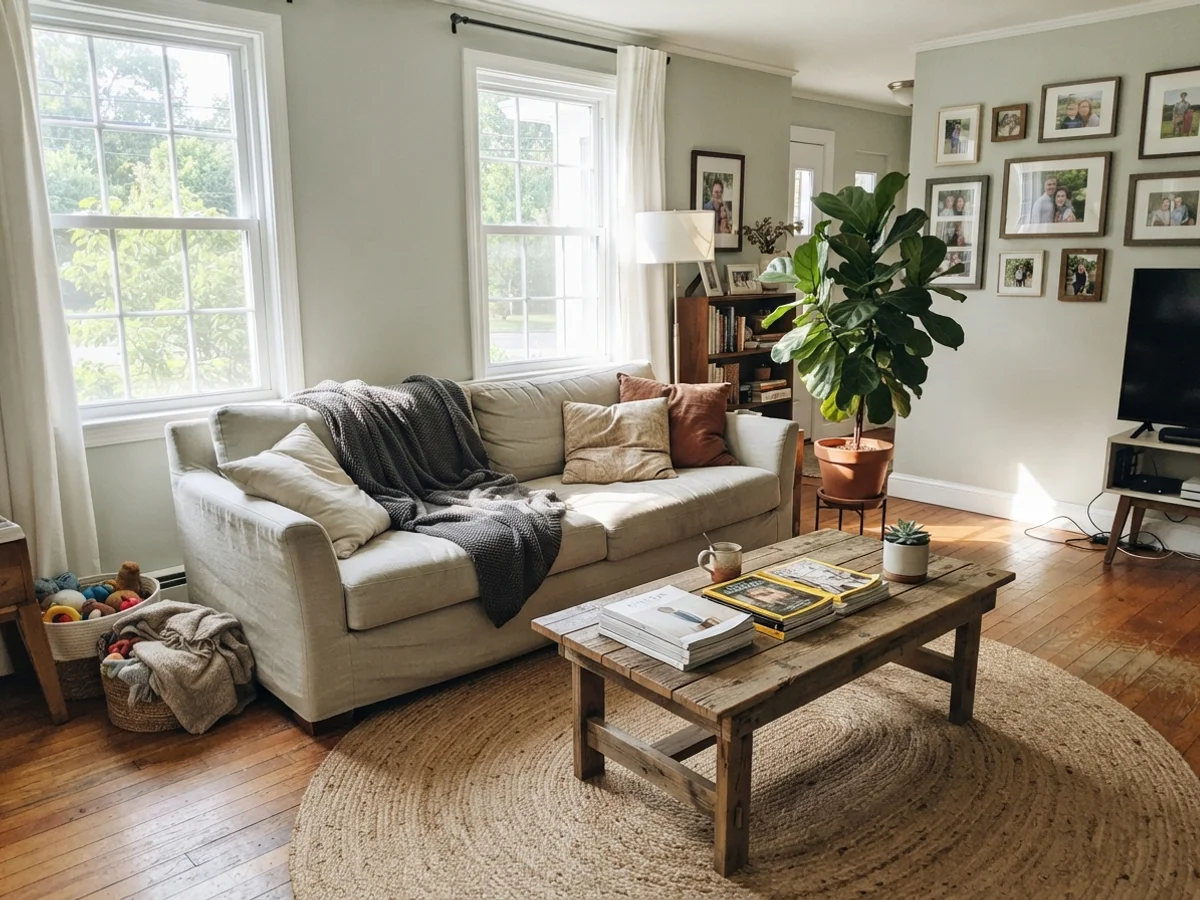
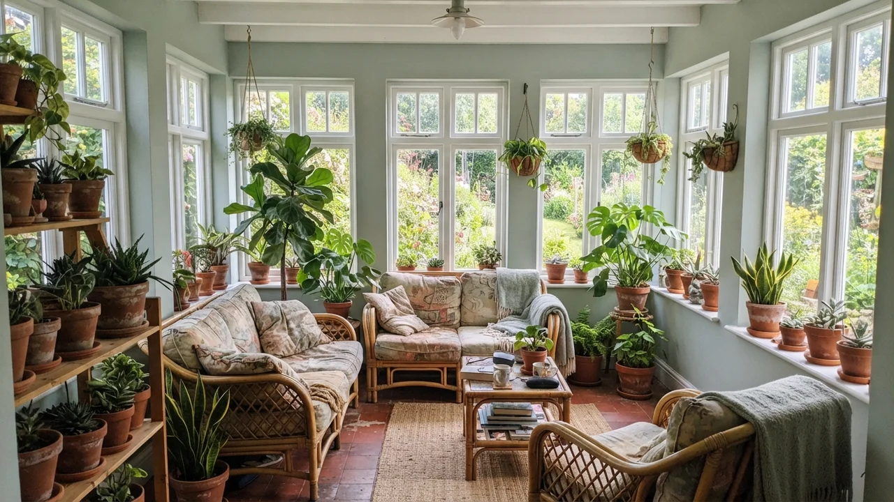
In main living areas, Sea Salt demands generous daylight to show its best self. In a living room blessed with midday sun from two large windows, the walls lean into a soft, airy sage that pairs effortlessly with linen upholstery, jute rugs, and warm wood coffee tables. It also shines in a sunroom wrapped in white-framed windows, where terracotta pots and leafy indoor plants pull the natural green right out of the wall.
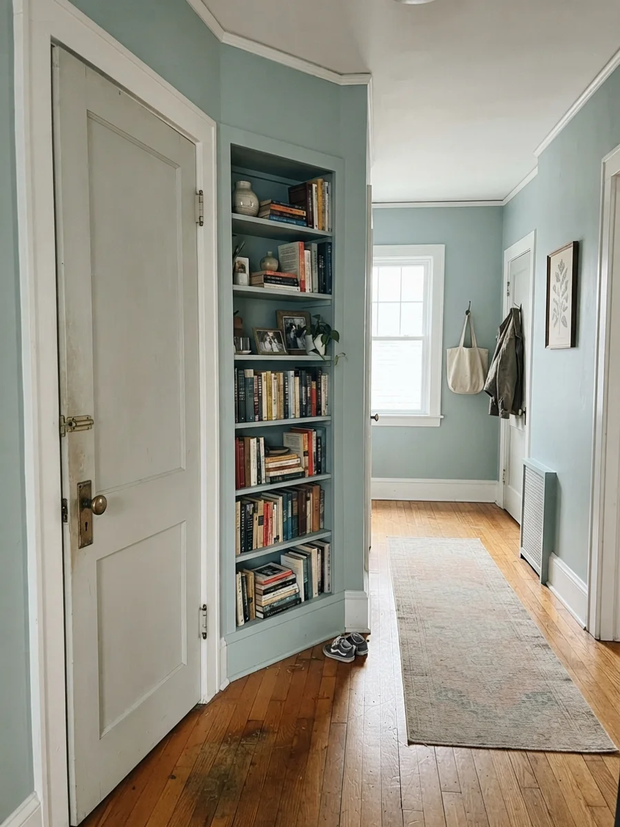
A quick note on trim: Sea Salt is generally too soft and light to serve as a baseboard trim under contrasting walls. However, using it on interior two-panel doors or built-in hallway bookcases against creamy walls creates a charming, layered look that feels grounded, especially when finished with classic brass hardware.
Laundry Rooms and Shaded Exteriors
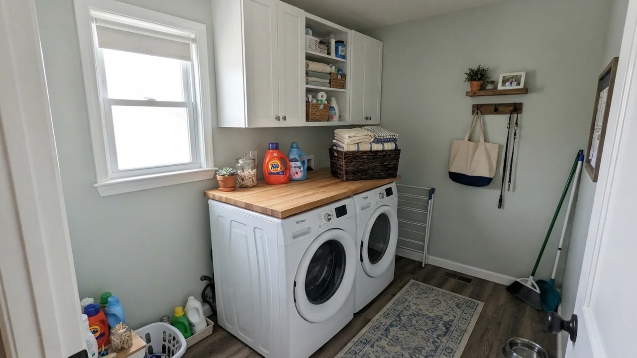
Utility spaces often suffer from dull builder paint. In a small laundry room with one good window, putting Sea Salt on the walls above white appliances, butcher-block counters, and white upper cabinets turns a chore zone into a pleasant corner of the home.
On house exteriors, caution is required. In blinding direct midday sun, Sea Salt's LRV 63 can wash out until it looks like an ambiguous faded off-white. But on horizontal siding in a shaded or coastal setting—especially caught in soft early-evening light with crisp white trim and a deep navy front door—it holds its composure gracefully.
Where Sea Salt Fails (And Why)
Sea Salt has one of the highest complaint rates of any top-50 paint color, and almost none of it is the paint's fault. Over three decades of repainting rooms, I have watched people blame the can when they really should have blamed the light, the tile, or the trim.
There are three specific situations where Sea Salt will disappoint you every single time:
- North-facing rooms with cool light: North light strips out warm green tones and pulls blue forward. If you put Sea Salt in a north bath expecting warm sage, you will get baby blue. If you want a green that stays green in cool light, choose Oyster Bay (SW 6206) instead.
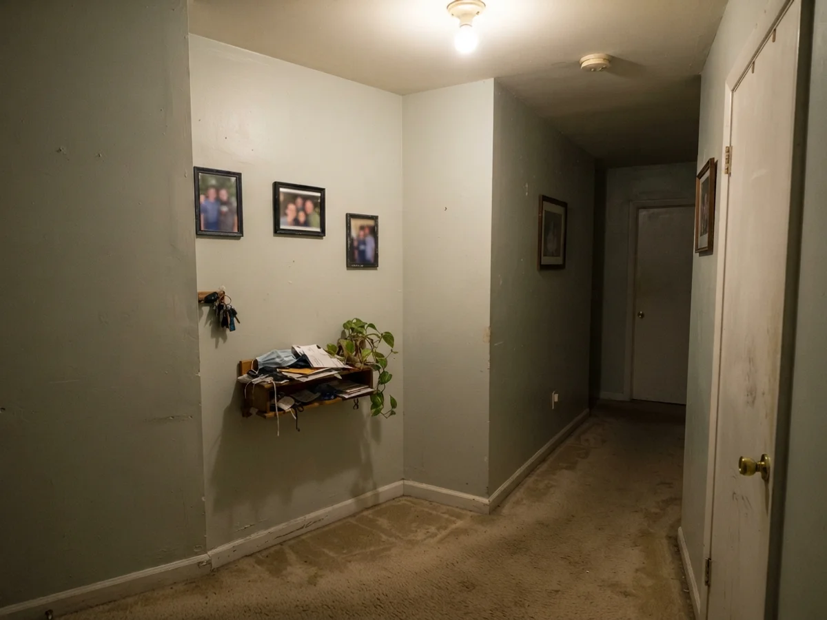
- Orange honey-oak floors and beige travertine: Sea Salt is cool-toned. When placed right against 1990s honey oak or warm beige travertine, the colors fight. The wood looks more aggressively orange, and the wall turns a dirty, muddy gray. If you have warm floors, go deeper and warmer with Comfort Gray (SW 6205).
- Windowless rooms on cool LED bulbs: In a dark interior hall or powder room lit by 4000K daylight LEDs, Sea Salt drains of all character. It reads flat, clinical, and putty-like. If you must use it in low light, swap your bulbs to 2700K warm white, or choose Rainwashed (SW 6211), which has the pigment density to hold its hue in shadows.
Durability, Sheens, and Living with It Long-Term
When you live with a paint color across five or ten years, how it cleans matters far more than how it looked when the painter packed his van. In our houses, I have tested Sea Salt across three different finishes:
- Walls in living areas & bedrooms: Use eggshell. It offers low glare while still allowing you to wipe off scuffs near light switches with a damp microfiber cloth.
- Bathrooms & laundry rooms: Always choose satin. Flat and matte finishes in a steamy bathroom will show water drip marks within six months. Satin forms a tighter barrier that survives steam, humidity, and splashes.
- Trim, doors & cabinetry: Use semi-gloss on standard trim and satin on kitchen cabinets or interior doors. A semi-gloss trim in Pure White provides the durability needed for vacuum cleaner bumps while delivering a clean contrast line.
Touching up Sea Salt after three or four years is relatively forgiving because of its muted, gray-heavy base. As long as you keep the original leftover can sealed tight and stir it thoroughly, small roller touch-ups blend in far better than they would with saturated blues or dark greens.
Why does Sherwin-Williams Sea Salt look blue on my bathroom walls?
Sea Salt contains a balance of green, gray, and blue pigments. In rooms with cool north-facing light, frosted privacy glass, or cool 4000K LED lighting, the warm green undertones disappear and the cool blue comes forward. Swapping your bulbs to 2700K warm white will help restore the green.
What is the best trim color to pair with Sea Salt?
Sherwin-Williams Pure White (SW 7005) or Extra White (SW 7006). Sea Salt needs a clean, crisp white next to it. Avoid warm yellow-creams like Dover White, which can make Sea Salt look dingy and unwashed.
Is Sea Salt too light for a living room?
Not if your living room has good natural daylight. At LRV 63, it reads as a soft, restorative neutral that adds subtle color without overwhelming furniture, rugs, or artwork. In windowless spaces, however, it can look flat.
Does Sea Salt work with honey oak cabinets and trim?
Generally no. The cool green-gray undertones in Sea Salt clash with the strong orange tones in honey oak, making the wood look harsher and the walls look muddy. If you have orange wood, consider Comfort Gray (SW 6205) instead.
What paint sheen should I use for Sea Salt in a bathroom?
Use a satin finish. Bathrooms face high humidity, steam, and frequent moisture wipe-downs. Satin resists water spotting and can be scrubbed clean without wearing away the paint film.
Susan's Verdict · A Masterpiece in the Right Light
Sea Salt earned its iconic status honestly. In a south- or east-facing bathroom with white subway tile, clean white trim, and warm lighting, there is simply no better soothing green-gray on the market. But if your room faces north, sits in a windowless basement, or borders orange honey-oak floors, don't force it. Paint a large sample board first, watch it across twenty-four hours, and trust what your own light tells you.